
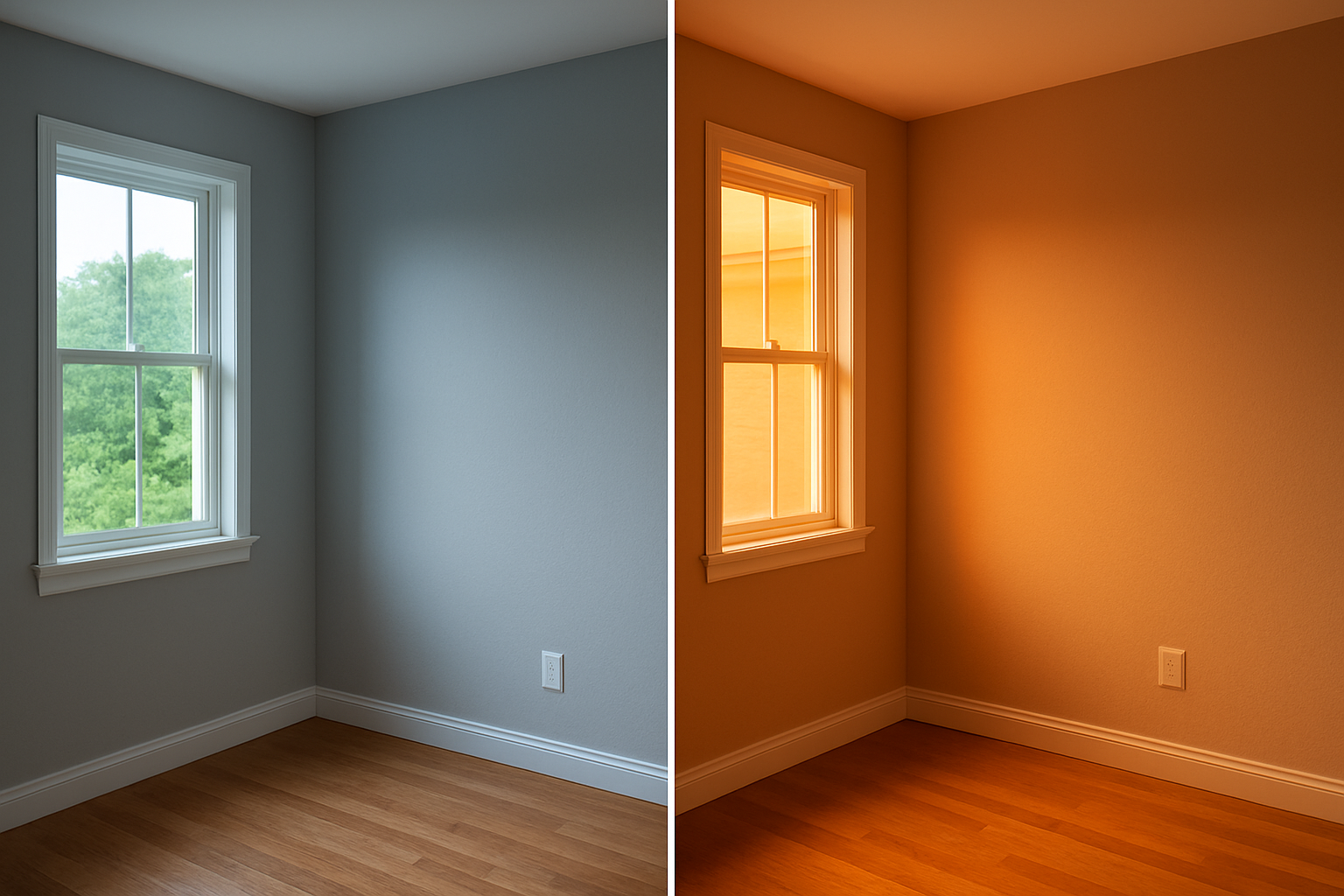
Choosing interior paint colors requires understanding two essential factors. First, identify what the room needs to accomplish. Second, analyze how light behaves in that specific space. Additionally, when you master these two elements, every other decision becomes clearer and more intuitive.
Table of Contents
- Key Takeaways
- Why Light Is the Real Decision-Maker
- Understanding Undertones Before You Buy
- How to Choose Colors Room by Room
- Paint Finishes and Why They Change Everything
- Testing Paint Before You Commit
- How Existing Elements Narrow Your Choices
- When to Call a Professional Painter
Key Takeaways
- Light direction and intensity affect how a paint color reads on the wall more than any swatch in the store.
- Undertones in neutral paints shift dramatically depending on flooring, furniture, and surrounding finishes.
- Paint finish matters as much as color: the wrong sheen can make a room look smaller, dirtier, or overly glossy.
- Test colors on large physical patches (at least 12×12 inches) on your actual wall before purchasing full gallons.
- Anchor your palette to one fixed element in the room, such as flooring or a sofa, rather than building from scratch.
- Professional color consultation and application saves money in the long run by reducing costly do-overs.
Why Light Is the Real Decision-Maker
Most people pick a paint color from a chip under store lighting. Then they bring it home and wonder why the wall looks nothing like what they expected. That disconnect happens because paint color is not a fixed property. It shifts based on the quality, direction, and quantity of natural and artificial light hitting the surface.
North-facing rooms receive indirect, cooler light throughout the day. Colors in these rooms tend to read darker and cooler than they do on the swatch. Warm tones like cream, terracotta, or sage can compensate effectively. However, cool grays and blues can feel flat and heavy in these spaces.
South-facing rooms get consistent, warm light for most of the day. As a result, almost any palette works well here. Crisp whites and light neutrals are especially forgiving in these naturally bright spaces.
East-facing rooms catch golden morning light. Then they shift to a cooler, shadowed tone by afternoon. If you spend most of your time in that room in the morning, warm tones will thrive. West-facing rooms do the opposite: they look muted during the day. Subsequently, they warm up significantly in the late afternoon, which is why understanding best paint new canaan ct weather conditions matters for long-term color stability.
Artificial lighting adds another layer of complexity. Incandescent and warm LED bulbs amplify yellows and reds. Cool white or daylight LEDs push colors toward blue and gray. Before committing to a color, hold your swatch under the bulbs you actually use in that room. Do not rely solely on window samples.
Understanding Undertones Before You Buy
This is where most DIYers encounter trouble. A white that looks bright and clean on the chip can turn distinctly pink, yellow, or green. This happens once it covers four walls surrounding your furniture and flooring. That shift comes from undertones.
Every paint color, including neutrals, has a dominant undertone. Beige can pull yellow, pink, or green. Gray can lean blue, purple, or green. Off-white can feel creamy, cool, or chalky depending on the light and surrounding elements.
The way to identify undertones accurately is to look at the color in context. Do not examine it in isolation. Hold the chip next to something you know is clearly warm (like a honey-oak floor) or clearly cool (like a slate tile). If the chip suddenly looks greenish, it has a green undertone you may not have noticed before. Therefore, this is why professional color consultants earn their fee. They train their eyes to see these shifts before paint is ever applied to a wall.
Learning how to choose a painter in new canaan ct can help you find someone with this expertise for complex projects.
If you are working with Sherwin-Williams or Benjamin Moore paint, both companies offer curated palettes. These palettes are pre-coordinated for undertone harmony. This approach removes some of the guesswork when you are trying to build a cohesive color flow from room to room.
How to Choose Colors Room by Room
A whole-home palette works best when it follows a natural flow. Adjacent rooms should share an undertone family even if the hues are different. A warm cream in the living room should transition to a warm taupe in the hallway. In contrast, a cool blue-gray creates a jarring shift that disrupts visual continuity.
Living Rooms and Common Areas
These rooms deserve color that feels settled and livable. Medium-value neutrals (neither too light nor too dark) tend to hold up well across changing daylight. Additionally, if you want a more dramatic look, deep, saturated colors on an accent wall create depth. They do this without overwhelming the space.
Bedrooms
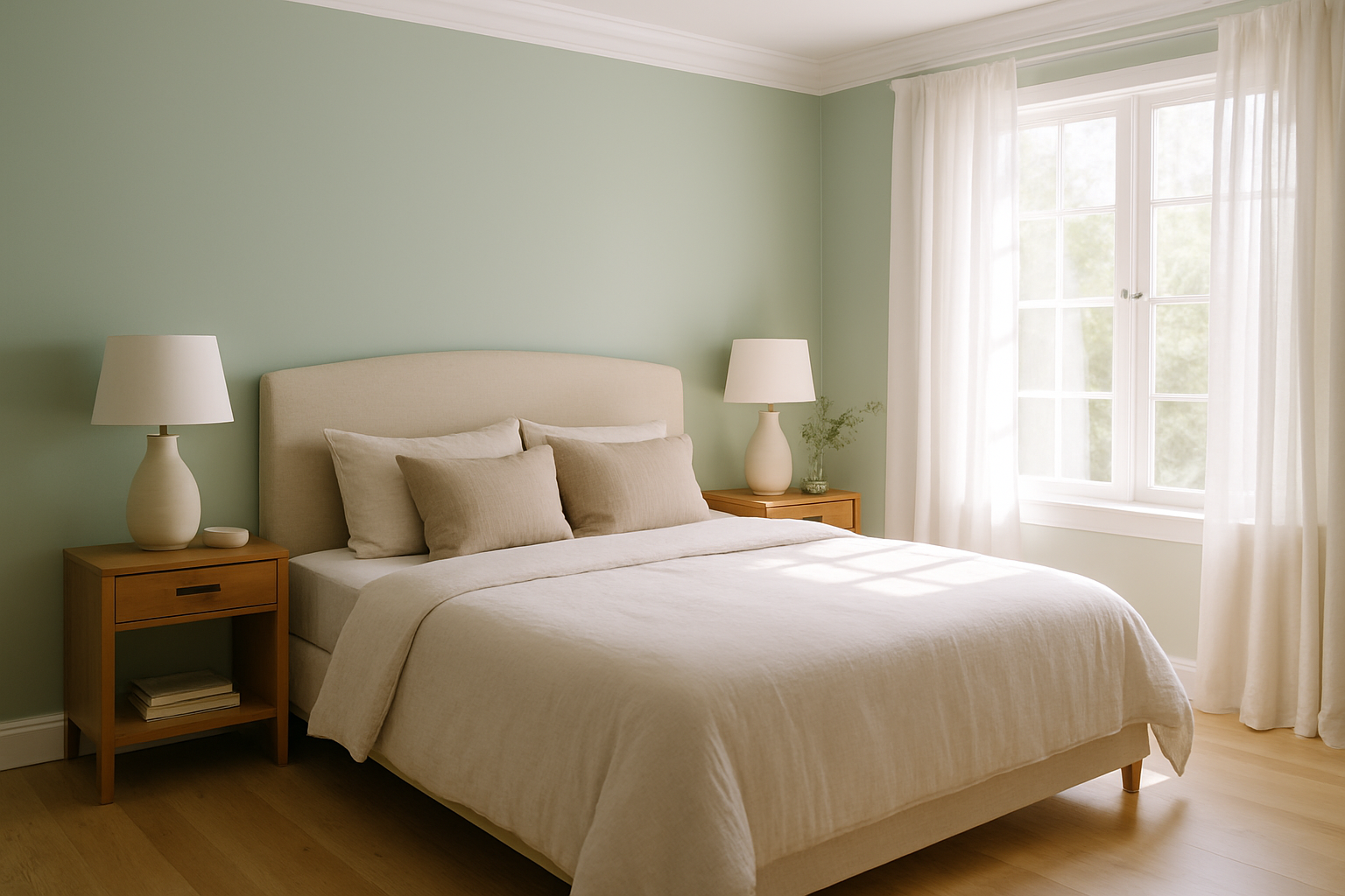
Bedrooms benefit from softer, lower-saturation colors. Blues, greens, and warm lavenders work well in sleep spaces because they tend to feel visually calming. However, your personal response to color matters more than general rules. If warm terracotta makes you feel relaxed, that is the right choice for your bedroom.
Kitchens
Kitchens are typically well-lit and see more visual activity than other rooms. Crisper, more saturated colors tend to hold their own here. White and off-white are perennial choices for cabinetry. Furthermore, wall colors in soft greens, warm yellows, and muted blues can add personality. They do this without competing with the workspace.
Bathrooms
Small bathrooms benefit from light, airy palettes that open up the space visually. In contrast, a bold, deep color in a powder room can feel intentional and dramatic. The room is meant for brief visits, not long stays. Therefore, this is one of the few places where a deep, saturated hue makes strategic sense in compact square footage.
Paint Finishes and Why They Change Everything
Color selection and finish selection are equally important. Many homeowners treat finish as an afterthought, but this is a critical mistake. Here is a quick breakdown of the standard finish options and where they work best:
| Finish | Sheen Level | Best Rooms | Notes |
|---|---|---|---|
| Flat/Matte | None | Ceilings, low-traffic walls | Hides imperfections; hard to clean |
| Eggshell | Very low | Living rooms, bedrooms | Washable; slight sheen |
| Satin | Medium-low | Hallways, children’s rooms | Durable; shows roller marks if applied poorly |
| Semi-Gloss | Medium-high | Kitchens, bathrooms, trim | Very washable; highlights wall flaws |
| Gloss | High | Doors, cabinetry, accent trim | Extremely durable; shows every surface defect |
Using the wrong finish amplifies problems significantly. A flat paint in a high-traffic hallway will show scuffs within months. A glossy finish on a wall with minor dings and texture irregularities will make those imperfections impossible to ignore. When in doubt, eggshell is the most forgiving all-purpose finish for most interior walls.
Testing Paint Before You Commit
Sampling is the single most cost-effective step you can take in the color selection process. Moreover, it is one most people do too quickly or skip entirely.
Buy sample pots (most cost between $5 and $10) and apply a patch no smaller than 12×12 inches directly on your wall. Do not apply the sample over another color without first applying a white primer patch. Otherwise, the existing color will skew your reading. Paint two coats on the sample patch and let it dry completely. Color shifts noticeably as paint cures, so this step matters.
Observe the samples at different times of day. Leave them up for at least 48 hours. Look at them in morning light, afternoon light, and under your artificial lighting at night. If all three versions of the color feel right to you, you have found a strong candidate.
If you are selecting multiple colors for an open-concept space, paint the samples on adjacent walls. This helps you see how they interact before buying full gallons. This step is especially important for understanding how to choose interior paint colors across connected rooms. It prevents creating a disjointed visual experience.
How Existing Elements Narrow Your Choices
Your furniture, flooring, and fixed finishes are the anchors of any color decision. These elements are typically much harder and more expensive to change than paint. Therefore, they should dictate your palette rather than compete with it.
Start with your floor. Wood floors with warm, reddish tones (like cherry or mahogany stain) push your wall color toward warm or neutral territory. Cool gray floors open the door to cooler wall palettes. This approach works without creating color tension.
Next, look at your trim. Most homes have white or off-white trim, but the specific white matters significantly. A bright cool white trim clashes with warm yellow-based wall colors. If your trim has a cream or ivory cast, your wall color needs a warm undertone. This ensures visual harmony throughout the space.
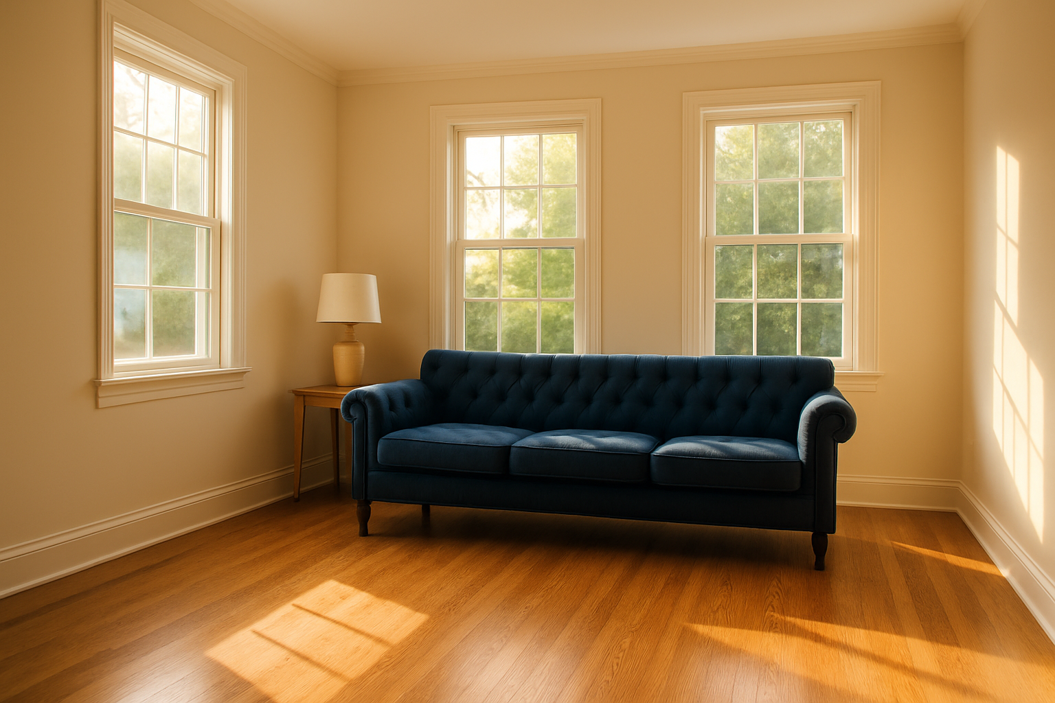
Finally, anchor to your largest furniture piece. A dark navy sofa, for example, can inform a whole palette of warm creams and natural wood accents. These elements balance the visual weight effectively. A sectional in warm camel leather suggests earthy tones, terracotta, or warm sage.
This approach is especially practical in Connecticut homes. Historic architecture and traditional millwork often include natural wood details, wainscoting, and built-ins. Understanding how best paint new canaan ct weather compatibility affects product performance plays a role in selection. Older homes in particular experience moisture and temperature cycles that affect how paint adheres and holds color over time.
When to Call a Professional Painter
There is a meaningful gap between choosing colors confidently and executing the application at quality that makes the color actually look the way you envisioned. Prep work, priming strategy, application technique, and product knowledge all affect the final result. A swatch or a YouTube video cannot fully account for these professional considerations.
Custom Colonial Painting employs painters with an average of 15 or more years of experience. The company exclusively uses Sherwin-Williams and Benjamin Moore products, which consistently rank among the highest-rated paints for coverage and color accuracy. If you are working on a room where color matters a great deal, such as a primary living area or a recently renovated space, professional application protects your investment.
Understanding the cost of painting in new canaan ct helps you budget realistically for a full-room project. This includes prep, priming, and finish coats. A professional estimate also factors in ceiling height, surface condition, and trim complexity. All these elements affect the final price.
For homeowners looking to vet contractors before hiring, resources on how to choose a painter in new canaan ct walk through what credentials and questions matter most. These include license verification, insurance coverage, and contract clarity. Similarly, if you are in the Greenwich area, guidance on how to choose a painter in greenwich ct covers the same due diligence process tailored to that market.
Custom Colonial Painting holds Connecticut HIC license #0630904. The company carries $2 million in general liability insurance and $500,000 in workers’ compensation coverage. Additionally, it is EPA Lead-Safe certified, which is particularly relevant in older Connecticut homes where lead-based paint may still be present. These are not just selling points. They represent the baseline standards any contractor you hire should meet.
Learning how to choose interior paint colors is only half of the equation. The other half is making sure the paint goes up correctly. Professional application uses the right products and the right technique. As a result, the color you selected on paper actually reads the way you expected on finished walls.
Things to Know
- Paint color chips in the store are printed on bright white card stock, which makes every color look lighter and more saturated than it will on a primed or previously painted wall.
- Benjamin Moore and Sherwin-Williams both offer color matching services, but even matched colors can vary slightly between brands due to differences in base formulas and pigment ratios.
- Dark accent colors typically require three coats over a light base to achieve full, even coverage without streaking or patchiness.
- In older Connecticut homes built before 1978, existing paint may contain lead. Disturbing it without proper precautions is a federal safety concern regulated under EPA guidelines. Always hire an EPA Lead-Safe certified contractor for these projects.
- Color temperature in paint is separate from the color temperature of your light bulbs, but the two interact constantly. Warm paint plus warm bulbs can feel overpowering; cool paint plus cool bulbs can feel sterile.
- Paint color looks different on different wall textures. A smooth, freshly skim-coated wall will reflect light differently than a textured or orange-peel surface, which means the same color can read differently in two rooms with identical lighting.
Transform Your Space With Colors That Actually Work
You have done the research. Now it is time to make sure the application matches the vision. Partnering with an experienced professional takes the guesswork out of color execution. They ensure the prep, priming, and finish work all support the results you are aiming for. Get a free personalized estimate from Custom Colonial Painting and find out exactly what your project will involve, what it will cost, and how quickly it can get done. Reach out today and let a team with 15-plus years of hands-on experience handle the details.
Frequently Asked Questions
Q: How many paint colors should I use in an open-concept living space?
Most open-concept spaces work best with two to three coordinated colors that share the same undertone family.
Limiting your palette keeps the space feeling cohesive rather than visually fragmented. A practical approach is to use one primary wall color. Add one slightly deeper or lighter variation for an accent or focal wall. Reserve one color for trim and architectural details. All three should read as part of the same tonal family when seen together.
Q: Should I paint the ceiling the same color as the walls?
Painting the ceiling the same color as the walls can work well in rooms where you want a cocooning or dramatic effect, but it is not the right move in every space.
In small rooms or rooms with low ceilings, a white or very light ceiling helps the room feel taller and more open. In larger rooms with high ceilings, extending the wall color onto the ceiling can feel intentional and sophisticated. The finish on the ceiling should almost always be flat or matte. This applies even if the walls use a different sheen, to reduce glare and hide minor surface imperfections overhead.
Q: What is the safest neutral wall color that works with almost any decor?
A warm, greige tone with a slight beige undertone tends to be the most universally adaptable neutral for most American home interiors.
Both Sherwin-Williams and Benjamin Moore offer well-regarded greige options. These options balance warm and cool without pulling too strongly in either direction. The key is to confirm the undertone works with your flooring before committing. Greige tones with a pink undertone can clash with floors that have orange or red-brown tones. Greige tones with a gray lean work well with cooler flooring like tile or whitewashed wood.
Q: How long should I wait between coats of interior paint?
Most interior latex paints require at least two to four hours of dry time between coats, though cure time is longer.
Dry time refers to how long before the surface is dry to the touch or ready for a second coat. Cure time—the point at which the paint reaches its full hardness and washability—typically takes two to four weeks. This depends on the product, temperature, and humidity levels in the room. Applying a second coat too soon can cause peeling, streaking, or uneven texture. Always follow the manufacturer’s instructions on the specific product you are using.
Q: Does primer color matter when painting over a dark or bold existing color?
Yes. Using a tinted primer matched to your topcoat color significantly reduces the number of finish coats needed and improves final color accuracy.
When painting over a deep red, navy, or dark green wall, a standard white primer can require four or more finish coats. This happens before the new color reads true. A tinted primer, mixed to approximately 50 percent of your topcoat formula, cuts that down to two coats in most cases. This matters both for time and cost, especially in larger rooms. Ask your paint retailer to tint the primer at the time of purchase rather than trying to mix it yourself.
The Bottom Line on How to Choose Interior Paint Colors
Getting interior paint colors right is a process, not a single decision. It requires understanding how light behaves in each room, reading undertones accurately, testing before committing, and selecting a finish that matches how the space is actually used. Each of those steps builds on the one before it. Skipping any one of them is where most color regrets begin.
If you are planning a painting project in Connecticut, Custom Colonial Painting brings the experience and materials to make your color choices look exactly the way you intended. Contact the team today for a free, no-obligation estimate and find out what professional color execution looks like from start to finish.