
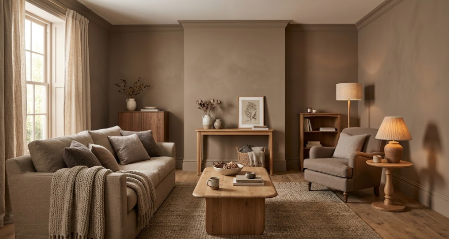
The best interior house paint colors in 2026 lean warm, earthy, and intentional — think mushroom neutrals, sandy khaki, soft sage green, and deep umber browns — replacing the cool grays and stark whites that dominated the past decade. Benjamin Moore’s 2026 Color of the Year, Silhouette, a deep burnt umber with charcoal undertones, and Sherwin-Williams’ Universal Khaki both reflect this same shift toward richer, more grounded tones that feel lived-in rather than sterile.
Key Takeaways
- Warm neutrals (mushroom, taupe, sandy khaki) are replacing cool grays as the default interior wall color for 2026.
- Benjamin Moore’s Silhouette and Sherwin-Williams’ Universal Khaki, the two brands’ 2026 Colors of the Year, both reflect this move toward warmth and depth.
- Muted, nature-inspired greens — sage, olive, eucalyptus — remain one of the most popular accent choices for their calming effect.
- Deep, moody colors are increasingly used on full rooms or accent walls rather than just small trim details.
- The “3 color rule” — one dominant, one secondary, one accent color — remains the most reliable framework for building a cohesive interior palette.
What Is the Most Popular Color to Paint the Inside of Your House?
Warm white and soft greige remain the most broadly popular interior wall colors overall, prized for their versatility and ability to work in nearly any room or lighting condition. Beyond those safe staples, warmer, richer neutrals — mushroom, taupe, and sandy khaki tones — have become the fastest-growing category for 2026, directly replacing the cooler gray tones that were dominant through much of the past decade.
This shift reflects a broader move away from stark, minimalist interiors toward spaces that feel warmer and more textured, often paired with natural materials like wood, linen, and stone.
What Are the Top 5 Colors for Interior Paint in 2026?
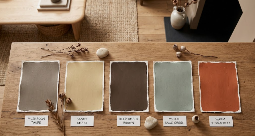
Based on current designer picks and paint brand color-of-the-year selections, these five colors and color families are leading 2026’s interior palette:
- Warm mushroom/taupe neutrals — the new default background color, replacing flatter grays.
- Sandy khaki (Sherwin-Williams Universal Khaki) — a warm, versatile neutral suited to nearly any room.
- Deep burnt umber (Benjamin Moore Silhouette) — a rich, enveloping brown-charcoal ideal for cozy, intimate spaces.
- Muted sage or olive green — a nature-inspired accent color that remains one of the most consistently popular choices for bedrooms and living areas.
- Warm terracotta or clay red — a desaturated, earthy red gaining ground as a full-room or accent color, a notable shift from years when reds stayed confined to small accent walls.
Best Colors by Room
Different rooms benefit from different approaches, and 2026’s trends offer clear direction for each:
- Living rooms — warm neutrals or a deep, enveloping brown like Silhouette work well for creating a cozy, gathering-focused feel.
- Bedrooms — muted sage, soft olive, or warm taupe tend to read as calming and restful, especially paired with linen textiles.
- Home offices and dining rooms — moody darks, including deep teal or burnt umber, are increasingly used for full rooms rather than just accent walls, creating a more intentional, enclosed feel.
- Kitchens — warm whites and sandy neutrals remain the most popular choice, balancing brightness with the broader move away from stark, cool tones.
- Bathrooms — soft sage, warm taupe, or a pale warm white pair well with natural materials like wood vanities and stone counters. See our guide on best paint for bathroom walls for finish-specific recommendations.
What Is the 3 Color Rule in Interior Design?
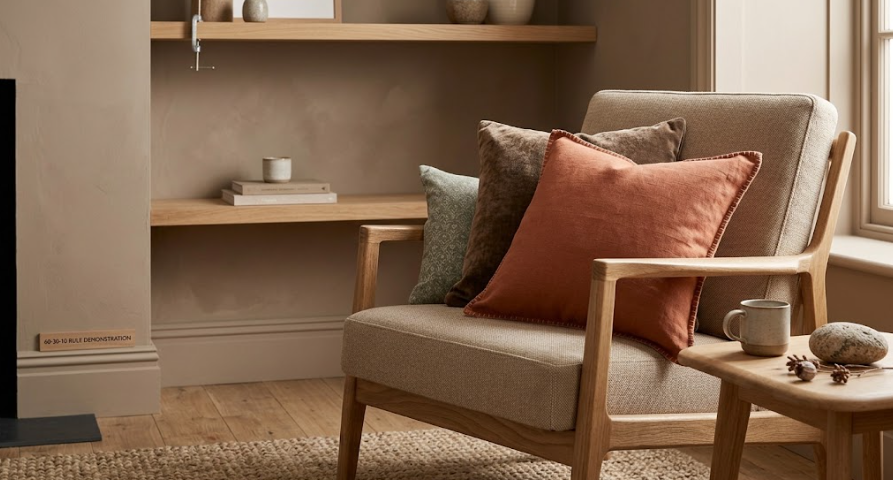
The 3 color rule is a simple framework for building a cohesive interior palette: choose one dominant color (roughly 60% of the space, typically walls), one secondary color (about 30%, often furniture or larger textiles), and one accent color (the remaining 10%, used for smaller details like pillows, art, or trim). This structure prevents a room from feeling either too monotone or too chaotic, since it establishes a clear visual hierarchy rather than letting every color compete equally for attention.
Applied to 2026’s trends, this might mean a warm mushroom wall color (dominant), natural wood and linen furniture (secondary), and a small pop of terracotta or deep green in accent pieces (the 10%).
What Color Makes a House Look Expensive?
Deep, saturated colors used with intention — rather than scattered throughout a home — consistently read as more upscale than an all-white, all-safe interior. Benjamin Moore’s Silhouette, a burnt umber with charcoal undertones, is specifically noted for reading as “architectural rather than decorative” when used on walls or cabinetry, anchoring a space the way wood paneling or stone once did.
Beyond dark, moody colors, warm off-whites and creamy neutrals paired with natural textures — oak flooring, linen upholstery, leather seating — also create an expensive, timeless look without leaning on trend-driven bold colors. The common thread is intentionality: a house looks expensive when its colors feel chosen for a reason, not just defaulted to.
What Is the Most Popular House Color Right Now?
For interiors specifically, warm mushroom and taupe neutrals are the most broadly popular choice right now, having overtaken the cooler grays that dominated interior design for much of the 2010s and early 2020s. For a bolder statement, Benjamin Moore’s Silhouette and Sherwin-Williams’ Universal Khaki — both 2026 Colors of the Year — represent the two clearest signals of where interior color preferences are headed this year.
Common Mistakes Homeowners Make When Choosing Interior Colors
- Defaulting to stark white or cool gray out of habit, rather than considering how a warmer neutral might better suit the room’s natural light.
- Skipping the 3 color rule, leading to rooms that feel either flat and monotone or visually chaotic.
- Choosing a bold color without testing it under different lighting, since natural and artificial light dramatically change how a color reads throughout the day.
- Not considering finish alongside color, since matte, eggshell, and satin finishes behave differently and suit different rooms.
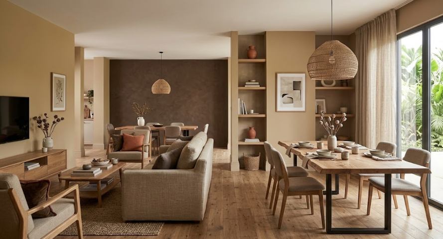
- Ignoring how color flows between connected rooms, which can make an open floor plan feel disjointed if adjacent colors don’t relate to each other.
Step-by-Step: Choosing Your Interior Color Palette
- Identify your dominant color first — the one that will cover roughly 60% of your space, typically the walls.
- Choose a secondary color for larger furniture or textile pieces that complements, rather than competes with, your dominant color.
- Select one accent color for smaller details like pillows, art, or trim, keeping it limited to avoid visual clutter.
- Test your chosen colors on actual wall sections, viewed at different times of day, before committing to a full room.
- Confirm the right finish for each room — matte or flat for living rooms and bedrooms, eggshell or satin for kitchens and bathrooms — and ensure proper wall prep before painting for the best result.
Final Thoughts
The best color for interior house paint in 2026 has moved firmly toward warmth — mushroom neutrals, sandy khaki, and deep, grounded browns and greens are replacing the cool grays and stark whites that defined the past decade. Whichever direction you choose, building your palette around the simple 60-30-10 structure will help the final result feel cohesive rather than accidental.
Ready to get started? Contact Custom Colonial Painting for a free in-person estimate on your interior painting project, and let our team help you choose a 2026-forward color palette that fits your home and lifestyle.
FAQ: Best Colors for Interior House Paint
What is the most popular color to paint the inside of your house?
Warm white and soft greige remain the most broadly popular interior colors overall, while warmer, richer neutrals like mushroom and sandy khaki have become the fastest-growing category for 2026. This reflects a broader shift away from the cooler gray tones popular in previous years.
What is the 3 color rule in interior design?
The 3 color rule divides a room’s palette into a dominant color (60%, typically walls), a secondary color (30%, often furniture), and an accent color (10%, used in smaller details). This structure creates visual hierarchy and helps prevent a room from feeling either too flat or too busy.
What are the top 5 colors for interior paint?
For 2026, the top colors include warm mushroom and taupe neutrals, sandy khaki, deep burnt umber, muted sage or olive green, and warm terracotta or clay red. These reflect a broader move toward warmer, earthier, and more intentional interior palettes.
What color makes a house look expensive?
Deep, saturated colors used intentionally — like Benjamin Moore’s Silhouette, a rich burnt umber-charcoal — tend to read as more upscale than an all-white, all-safe interior. Warm off-whites paired with natural textures like wood and linen also create a timeless, expensive look.
What is the most popular house color right now?
Warm mushroom and taupe neutrals are currently the most popular interior color choice, having overtaken the cooler grays common in past years. For a bolder statement, Benjamin Moore’s Silhouette and Sherwin-Williams’ Universal Khaki represent the clearest signals of where 2026’s interior color trends are headed.