Color has a powerful impact on mental health, influencing emotions, mood, and even physiological responses. In 2025, homeowners are increasingly turning to therapeutic paint colors to create spaces that alleviate anxiety and uplift mood. Experienced painting contractors have noted a growing demand for soft, muted tones that promote emotional well-being and provide a sense of comfort and balance.
Here are seven expert-recommended paint colors that help ease anxiety and reduce depression—turning your home into a sanctuary of peace and positivity.
Table of Contents
Key Takeaways
✔ Soft blue creates a tranquil environment that reduces feelings of anxiety and promotes relaxation.
✔ Muted green evokes nature, grounding the mind and improving focus.
✔ Warm gray provides a soothing, neutral backdrop that prevents overstimulation.
✔ Lavender has calming properties that can ease anxiety and promote restful sleep.
✔ Beige fosters a sense of stability and warmth, reducing feelings of isolation.
✔ Soft pink creates a nurturing, uplifting atmosphere that soothes emotional distress.
✔ Pale yellow stimulates optimism and energy, counteracting depressive moods.
1. Soft Blue
Soft blue has long been associated with tranquility, making it one of the best choices for reducing anxiety. Its connection to the sky and ocean helps evoke a sense of expansiveness, allowing the mind to feel more at ease.
How Soft Blue Promotes Calm and Focus
- Creates a Sense of Open Space: Soft blue reflects natural light, making a room feel larger and more open. Licensed painting contractors often suggest this shade for smaller rooms or spaces with limited natural light.
- Lowers Heart Rate and Blood Pressure: Studies have shown that blue tones can have a physiological effect by reducing heart rate and lowering blood pressure. Experienced painting contractors recommend soft blue in bedrooms to create a tranquil environment that supports sleep.
- Pairs Well with Natural and Neutral Accents: Soft blue complements natural wood, white trim, and earth-toned furniture, creating a harmonious look. House painting and drywall repair experts suggest combining soft blue with soft beige or gray for a balanced and cohesive feel.
2. Muted Green
Muted green brings the calming essence of nature indoors, making it an ideal choice for stress relief. Experienced painting contractors often recommend muted green for home offices and living rooms to encourage focus and relaxation.
How Muted Green Restores Balance and Calm
- Connects with Nature: Muted green mimics the shades of trees and plants, reinforcing a natural, calming effect. Licensed painting contractors suggest using it in spaces with large windows or plants to strengthen the connection to the outdoors.
- Encourages Mental Clarity: Studies have shown that green can improve focus and reduce mental fatigue. Wall painting professionals recommend muted green for workspaces and reading areas to create a productive but relaxed environment.
- Works Well with Warm and Cool Tones: Muted green blends easily with both warm and cool shades, making it highly versatile. House painting and drywall repair experts suggest pairing it with light wood, beige, and off-white to maintain a soothing and balanced feel.
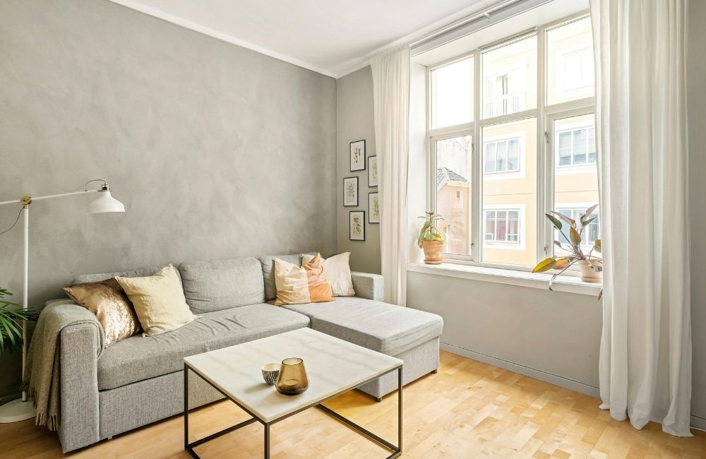
3. Warm Gray
Warm gray is an understated but powerful color when it comes to emotional regulation. It provides a stable and comforting backdrop that reduces overstimulation while still feeling inviting. House painting contractors often recommend warm gray for living rooms and kitchens to create a relaxing yet stylish atmosphere.
Why Warm Gray is Effective for Managing Anxiety and Depression
- Creates a Soothing, Safe Atmosphere: Unlike stark whites or overly bold colors, warm gray helps soften harsh lighting, making a space feel more comforting.
- Adds Depth Without Overwhelming the Senses: Subtle warmth in gray tones makes rooms feel cozy rather than cold or sterile.
- Pairs Well with Calming Accents: Warm gray complements soft blues, muted greens, and beige for a tranquil, cohesive feel.
4. Lavender
Lavender’s soft purple tones evoke a sense of calm and tranquility while adding a subtle touch of color. Its floral-inspired hues are known to reduce stress and improve relaxation, making it a popular choice for bedrooms and meditation spaces.
How Lavender Promotes a Calm State of Mind
- Naturally Lowers Stress Levels: Lavender has been shown to reduce cortisol levels, the hormone linked to stress. Licensed painting contractors often recommend this color in bedrooms and relaxation areas to support a peaceful atmosphere.
- Provides a Soft Pop of Color: Unlike bolder shades of purple, lavender offers a gentle touch of color without feeling overwhelming. Experienced painting contractors suggest combining lavender with soft grays and whites for a balanced, relaxing palette.
- Complements Modern and Traditional Decor: Lavender’s versatility makes it suitable for both contemporary and classic interiors. House painting and drywall repair professionals recommend using it with silver, white, or pale blue for a cohesive and timeless look.
5. Beige
Beige remains a timeless choice for creating a warm and inviting atmosphere, while white reflects light, making even small spaces feel larger and more open. Its neutral tone provides a sense of comfort and stability, making it an ideal base color for almost any room. Experienced painting contractors recommend beige for living rooms and common areas to create a welcoming and low-stress environment.
Why Beige is a Reliable Choice for Stress Relief
- Creates a Cozy, Grounded Feel: Beige’s warmth helps rooms feel grounded and secure without adding visual clutter. Licensed painting contractors recommend it for open-concept spaces to tie different areas together seamlessly.
- Blends Easily with Various Textures and Materials: Beige works well with wood, stone, and soft fabrics, making it easy to layer different textures. Wall painting professionals suggest pairing beige with linen curtains and natural wood furniture for a cozy, relaxed look.
- Reflects Light Without Harshness: Beige reflects light in a soft, diffused way, keeping rooms bright without feeling stark. House painting and drywall repair experts recommend beige for rooms with limited natural light to create a soft, inviting glow.
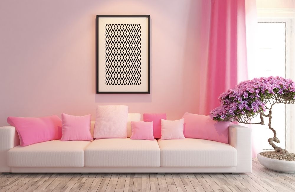
6. Soft Pink
Soft pink has a nurturing and soothing quality that can help regulate emotions. It is often associated with warmth, comfort, and compassion—qualities that are particularly beneficial for those experiencing depression or emotional distress.
Why Soft Pink is a Mood-Booster
- Reduces Feelings of Isolation: The warmth of soft pink creates an inviting space, helping to combat loneliness and low moods. Licensed painting contractors suggest using it in bedrooms and relaxation areas to make spaces feel more comforting and intimate.
- Enhances Natural and Artificial Light: Soft pink diffuses light beautifully, adding warmth and softness to any room. Experienced painting contractors recommend it for rooms with moderate light exposure to enhance brightness without harshness.
- Works Well with Neutral and Metallic Accents: Pairing soft pink with beige, white, or gold accents enhances its soothing and elegant effect. Wall painting professionals suggest combining soft pink with white trim and gold accents for a sophisticated, balanced look.
7. Pale Yellow
Pale yellow brings a cheerful, uplifting energy to a room while maintaining a calming effect. House painting contractors often recommend pale yellow for kitchens, dining rooms, and home offices where a balance of warmth and focus is needed.
How Pale Yellow Adds Cheer Without Overstimulation
- Creates a Bright and Inviting Atmosphere: Pale yellow reflects natural light effectively, making rooms feel more spacious and open. Licensed painting contractors suggest using it in rooms with limited sunlight to create a brighter, more inviting feel.
- Boosts Mood and Energy: Studies have shown that yellow tones can improve mood and increase energy levels without causing overstimulation. Experienced painting contractors recommend pale yellow for kitchens and home offices to encourage positivity and focus.
- Pairs Well with Cool and Warm Accents: Pale yellow works with both warm and cool tones, making it highly versatile. House painting and drywall repair professionals suggest combining pale yellow with soft gray, white, or light blue for a balanced and cohesive look.
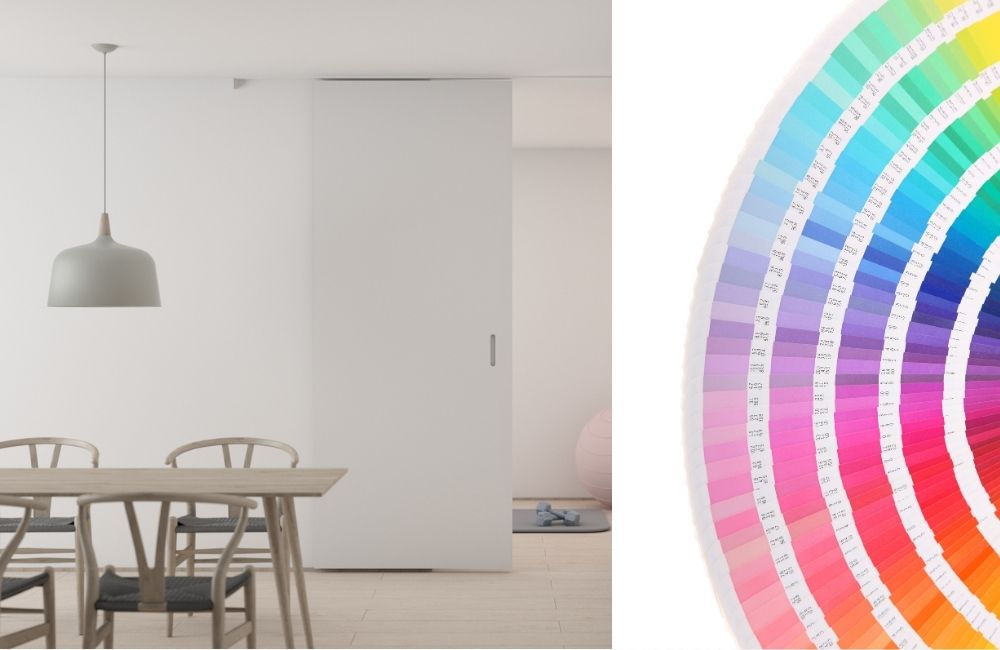
How to Create a Color Palette for a Cohesive Look
A well-designed color palette creates flow and balance throughout a home, helping homes increase in value. In fact, according to Remodeling Magazine’s Cost vs. Value report 2024, a minor kitchen remodel — including cabinet painting — can offer a 96% return on investment when done before selling a home.
Experienced painting contractors in Westport, CT, recommend selecting complementary shades that enhance the overall mood without clashing. Following a structured approach helps avoid visual chaos and ensures a polished, harmonious finish.
1. Start with a Base Color
Choosing a base color sets the tone for the entire palette. House painting contractors recommend starting with a soft neutral, like warm gray, beige, or soft white, to create a consistent foundation. Licensed painting contractors suggest using the base color on larger surfaces, such as walls and ceilings, to anchor the design and make accent colors stand out.
2. Choose an Accent Color for Depth
An accent color adds personality and contrast without overwhelming the space. Experienced painting contractors suggest choosing a rich but calming shade, such as muted green, navy blue, or soft terracotta, to create focal points. House painting contractors often recommend using accent colors on smaller surfaces, like trim, doors, or an accent wall, for balanced contrast.
3. Add a Coordinating Shade for Balance
A coordinating shade bridges the gap between the base and accent colors, creating a balanced flow. Licensed painting contractors suggest using soft hues, like dusty blue or pale pink, to complement both the base and accent tones. House painting and drywall repair professionals often recommend applying coordinating shades to furniture, fabrics, or decorative elements to tie the room together.
4. Consider Undertones and Lighting
Undertones play a significant role in how colors appear under different lighting conditions. Experienced painting contractors advise choosing shades with similar undertones (warm or cool) to prevent clashing. House painting contractors recommend testing paint samples at different times of the day to see how natural and artificial light affect the color’s undertones.
5. Limit the Number of Colors to Avoid Overload
Too many colors can create visual chaos and make the space feel busy. Wall painting professionals recommend sticking to three to five colors per palette, including the base, accent, and coordinating shades. Licensed painting contractors suggest using texture and patterns instead of additional colors to add variety without compromising cohesion.
6. Repeat Colors Strategically Throughout the Space
Repeating colors in different areas of the home creates a sense of flow and unity. House painting contractors recommend using the same accent or coordinating color in different rooms through furniture, textiles, or artwork. Experienced painting contractors suggest keeping the base color consistent across adjoining rooms to create a seamless transition between spaces.
Preparing Walls for a Smooth Finish
A smooth, professional-looking paint job starts with proper wall preparation. Experienced painting contractors know that skipping this step can lead to uneven coverage, poor adhesion, and visible imperfections.
1. Clean the Walls Thoroughly
Dust, dirt, and grease can prevent paint from adhering properly. House painting contractors recommend wiping down walls with a damp sponge and mild detergent to remove buildup. Licensed painting contractors also suggest using a degreaser for kitchens or high-traffic areas to eliminate any oily residue that might interfere with the paint’s finish.
2. Repair Cracks, Holes, and Surface Damage
Filling in cracks and holes creates a smooth, even surface for painting. House painting and drywall repair experts recommend using spackle or joint compound to patch small imperfections and sanding them down once dry. Experienced painting contractors advise inspecting corners and edges for hidden cracks that could cause paint to chip over time.
3. Sand the Surface for a Smooth Base
Sanding helps remove rough spots, old paint drips, and uneven textures. Licensed painting contractors suggest using fine-grit sandpaper (120- to 150-grit) to smooth out patched areas and glossy finishes. House painting contractors recommend wiping down the surface with a tack cloth afterward to remove any dust before painting.
4. Apply a High-Quality Primer
Primer creates a solid base that helps the paint adhere properly and last longer. Experienced painting contractors recommend using a stain-blocking primer for areas with water stains or discoloration. Wall painting professionals suggest tinted primer when using dark or bold colors to reduce the number of top coats needed for full coverage.
5. Tape Off Edges and Fixtures
Using painter’s tape ensures clean, sharp edges and prevents accidental paint splatters. Licensed painting contractors recommend taping along trim, baseboards, and window frames for a professional finish. House painting and drywall repair experts suggest removing the tape carefully while the paint is still slightly wet to avoid peeling or lifting.
How to Combine Paint Colors with Furniture and Decor
Choosing the right paint colors is only half the battle — pairing them effectively with furniture and decor completes the look. Experienced painting contractors recommend creating a cohesive color scheme that enhances both the walls and the furnishings.
1. Match Undertones for a Unified Look
Paint colors and furniture should share similar undertones to create harmony. House painting contractors suggest identifying whether a color has warm or cool undertones and selecting furniture pieces with matching tones. Licensed painting contractors recommend pairing warm beige walls with earthy fabrics and wood finishes, while cool grays work better with metal and blue accents.
2. Use Contrast to Create Depth
Balanced contrast keeps a space from feeling flat or monotonous. Experienced painting contractors recommend using light-colored walls with darker furniture or vice versa. Wall painting professionals suggest adding contrast with throw pillows, rugs, and artwork to give the space more dimension without overwhelming the color palette.
3. Incorporate Textures and Patterns
Mixing textures and patterns prevents the space from looking too uniform. House painting contractors recommend pairing matte wall finishes with textured furniture like linen or velvet to create depth. Licensed painting contractors suggest adding patterned accents, such as pillows or rugs, to introduce visual interest while keeping the color palette consistent.
4. Create a Focal Point with an Accent Color
An accent color can tie the room together and create a natural focal point. Experienced painting contractors suggest choosing a bold color for a feature wall, artwork, or a standout piece of furniture. Wall painting professionals recommend using complementary shades in small decor pieces, like lamps and cushions, to reinforce the accent color without overwhelming the room.
5. Balance Light and Dark Tones
Mixing light and dark tones creates a sense of balance and structure. Licensed painting contractors recommend using light-colored walls with dark furniture to anchor the space or dark walls with lighter decor to prevent the room from feeling heavy. House painting and drywall repair experts suggest layering neutral tones, such as gray and beige, to maintain a soft but structured look.
Frequently Asked Questions (FAQs)
What are the best calming paint colors for small rooms?
Soft, light shades like pale blue, muted green, and soft pink work well in small rooms because they make the space feel more open and airy. Experienced painting contractors recommend avoiding dark or saturated tones in small rooms, as they can make the space feel cramped. Licensed painting contractors often suggest using a consistent light base color throughout to create the illusion of more space.
How long should paint dry before placing furniture back in the room?
Most paint finishes require at least 24 hours to dry before moving furniture back into the room. House painting contractors recommend waiting at least 48 hours for high-traffic areas to prevent scuffing and damage. Experienced painting contractors suggest using fans and opening windows to speed up the drying process while avoiding excessive humidity.
What’s the difference between flat, eggshell, and satin paint finishes for calming colors?
Flat finishes have no sheen and provide a soft, velvety look, which is ideal for hiding wall imperfections. Eggshell has a slight sheen and is easier to clean, making it a popular choice for bedrooms and living rooms. Satin offers more durability and a soft glow, which experienced painting contractors recommend for high-traffic areas like hallways and kitchens.
How can you prevent paint from fading over time?
Direct sunlight and poor-quality paint can cause color fading over time. Licensed painting contractors recommend using high-quality, UV-resistant paint to prevent discoloration. House painting contractors also suggest closing blinds or using sheer curtains to minimize direct sun exposure during peak hours.
Can you paint over existing paint, or does it need to be removed first?
In most cases, you can paint over existing paint as long as the surface is clean and in good condition. Experienced painting contractors recommend sanding glossy finishes and applying a primer to help the new paint adhere better. House painting and drywall repair experts suggest removing any chipped or peeling paint to ensure a smooth, long-lasting finish.

Paint Your Way to a Calmer, Happier Home with Custom Colonial Painting!
The colors in your home have a profound impact on your mental and emotional well-being. By choosing calming, mood-boosting paint colors, you can create a space that eases anxiety, lifts your spirits, and promotes a sense of peace. Soft blues and muted greens encourage relaxation and clarity, warm grays and beiges provide stability, while lavender, soft pink, and pale yellow offer nurturing comfort and optimism.
Ready to bring tranquility to your Westport, CT home? Custom Colonial Painting offers expert guidance and professional painting services to bring your vision to life.
Schedule a consultation today and create a home that supports your well-being—one color at a time!