
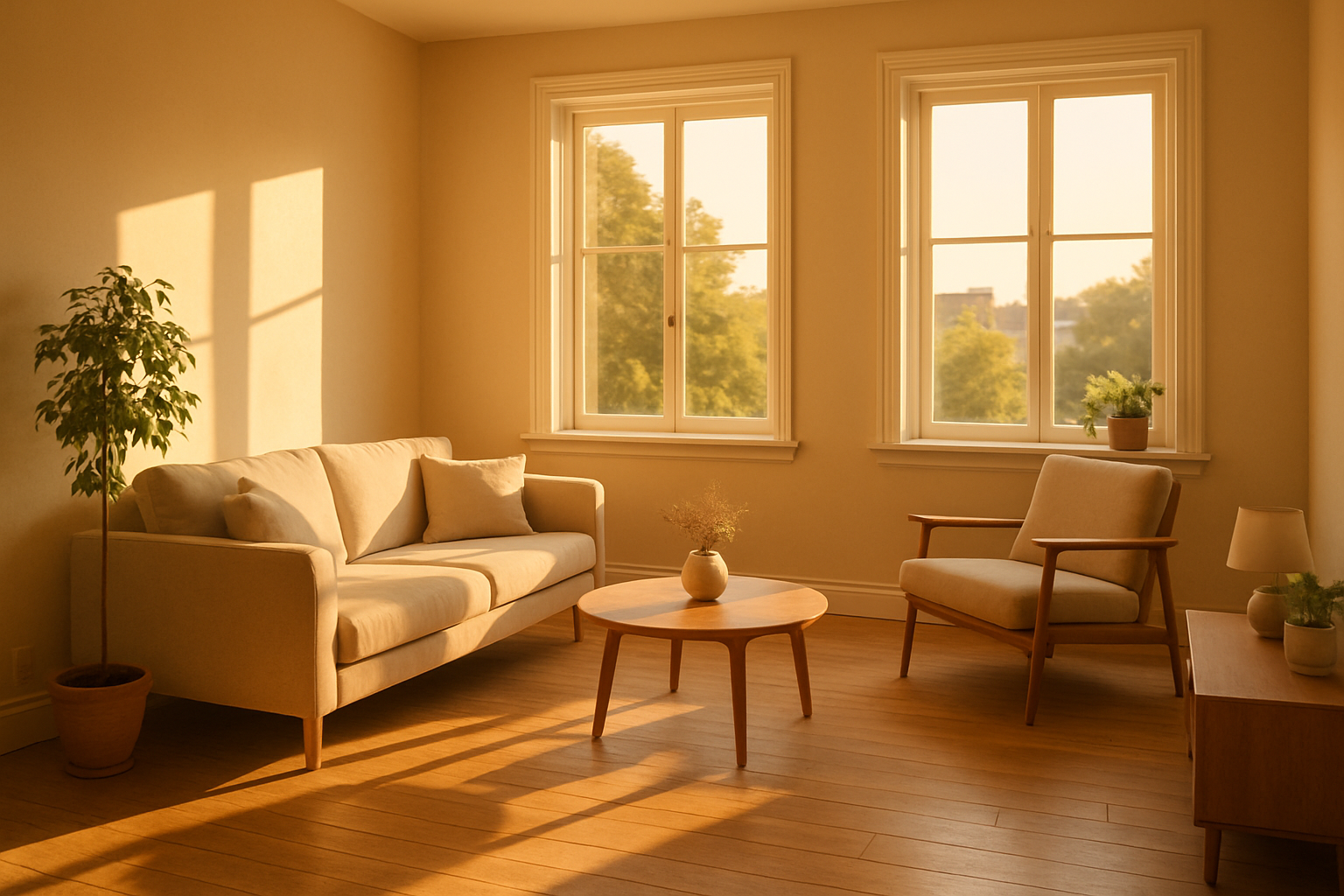
Finding the best paint colors for living room spaces requires balancing natural light, furniture tone, and the mood you want to create. Getting this right takes more than picking a shade you like on a chip. You need to understand how color behaves across different times of day. You must consider how it looks against your existing finishes. Additionally, you should evaluate how it performs within the scale of your specific room.
Key Takeaways
- Undertones matter more than the main color — a “gray” with purple undertones reads completely differently from one with green undertones once on the wall.
- North-facing rooms need warmer hues to compensate for cooler, indirect light; south-facing rooms can handle cooler tones without looking cold.
- Sheen level affects how a color looks as much as the pigment itself — flat and matte finishes absorb light, while eggshell and satin reflect it.
- Trim color is not an afterthought; the contrast or harmony between wall and trim defines the architectural character of the room.
- Testing paint on the actual wall (not a sample board) in multiple lighting conditions is the single most effective way to avoid expensive regret.
- Professional painters with experience on specific paint brands can flag undertone problems and finish mismatches before a drop hits the wall.
Why Living Room Color Is More Complicated Than It Looks
Most people walk into a paint store and grab a few chips. They hold them up to the wall and commit. That process almost always leads to a repaint within two years. Color in a living room is one of the most context-dependent decisions in interior design. Moreover, the context changes constantly: morning sun through east-facing windows looks nothing like the overhead lamp light at 9 p.m.
The three biggest variables determine whether a color works: light source, room size, and fixed finishes. Fixed finishes include flooring, cabinetry if the living room is open to a kitchen, fireplace stone or brick, and any built-ins. You cannot change these without significant cost. Therefore, your wall color must work around them.
Undertones are the hidden driver of most color failures. A warm beige wall next to a cool gray sofa will create subtle visual tension. This tension makes both elements look slightly off. This is not a matter of personal taste — it is how human color perception works. When how to choose a painter in new canaan ct can help guide your process, identify its undertone first. Hold paint chips against a white piece of printer paper to reveal undertones faster than anything else.
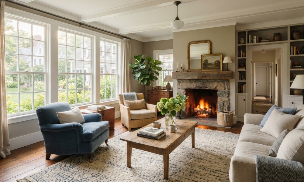
Colors That Reliably Perform in Best Paint Colors for Living Rooms
Warm Whites and Off-Whites for Your Best Paint Colors for Living Room
Warm whites are the most versatile living room colors. They expand perceived square footage and reflect both natural and artificial light efficiently. Additionally, they stay neutral enough to anchor almost any furniture palette. The key distinction is warm versus cool white. Warm whites carry yellow, cream, or pink undertones — Sherwin-Williams’ Alabaster (SW 7008) is a widely recognized example. Cool whites lean blue or green and can feel sterile in living rooms lacking abundant natural light.
Off-whites work particularly well in rooms with wood floors. They perform well with traditional or transitional furniture. They do not compete with art or textiles. Therefore, your decorative investment reads clearly on the wall rather than fighting with it.
Greige (Gray-Beige Hybrids) for Best Paint Colors for Living Room Spaces
Greige occupies the middle ground between gray and beige. It became one of the most-used residential colors over the past decade for good reason. It reads as sophisticated without committing hard to a cool or warm palette. Benjamin Moore’s Revere Pewter (HC-172) is one of the most frequently specified greige tones in New England homes. However, it skews green in rooms with limited light.
If your living room has abundant south or west-facing windows, greige performs exceptionally well. In darker rooms, test carefully — the green undertone can dominate.
Soft Sage and Muted Greens
Muted greens have moved from trend to staple. Designers call them “naturalistic neutrals.” They read as calm and do not compete with skin tones the way strong blues sometimes can. Furthermore, they pair naturally with wood tones and linen textiles. Sherwin-Williams’ Retreat (SW 6207) and Benjamin Moore’s October Mist (1495) both represent this category at different saturation levels.
Sage and muted green work best in rooms with medium to strong natural light. In a low-light north-facing living room, they can read grayish-green and feel uninviting.
Navy and Deep Blue for Best Paint Colors for Living Room Design
Deep blues used in living rooms create a sense of enclosure. Many homeowners find this cozy rather than confining. This effect holds true provided the room has adequate ceiling height and light sources. Navy functions well as a full-room color in rooms above 300 square feet. In smaller spaces, use it as an accent wall.
The critical pairing for navy is white trim. Without bright trim contrast, navy reads as flat and heavy. With crisp white trim and proper lighting, the combination has a classic appeal. It holds up over many years without feeling dated.
Warm Terracotta and Clay Tones
Terracotta and clay have re-entered residential use. This reflects a broader shift toward earthy, tactile interiors. These colors work well in living rooms with southern or western light exposure. They complement natural fiber rugs, leather furniture, and exposed wood beams. However, they are less forgiving in rooms with abundant cool-toned metals or stark white built-ins.
How Light Exposure Should Drive Your Decision
Light direction is the most underweighted factor in color selection. It matters more than any other variable in a living room.
- North-facing rooms receive indirect, cooler light throughout the day. Warm hues compensate for this — cream, warm greige, soft amber, and warm sage all prevent the room from feeling cold and dim.
- South-facing rooms get consistent, warm light most of the day. These rooms can handle cooler tones (blue-grays, cooler whites, sage) without losing warmth.
- East-facing rooms receive warm morning light and cooler afternoon light. Colors with balanced undertones perform most consistently across the day.
- West-facing rooms see the most dramatic daily shift — cool and potentially dim in the morning, warm and golden in the late afternoon. Medium-value hues handle this range better than very light or very dark shades.

Sheen Level: The Factor Most Homeowners Overlook
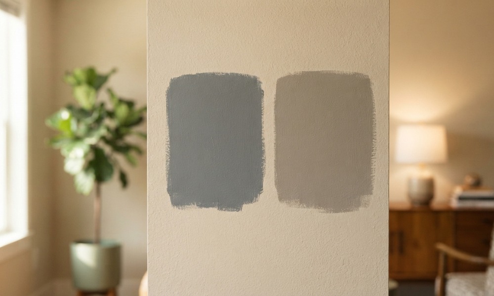
Sheen is not just a finishing preference — it changes how a color reads on the wall. Flat and matte finishes absorb light. They make colors appear slightly deeper and more saturated. Eggshell adds very subtle reflectivity that lifts lighter colors. Satin reflects more light and is more washable. Therefore, it is appropriate for high-traffic living areas with children or pets.
Most interior designers specify eggshell for living room walls. It balances color accuracy with practical durability. Flat finishes hide imperfections in older plaster walls. This consideration matters in many Connecticut homes with pre-1970s construction. If your walls have texture or age-related irregularities, a flat or matte finish may serve you better despite the trade-off in scrubbability.
Trim sheen is typically semi-gloss. It creates a visible contrast between wall and trim surfaces even when both are painted white. This contrast defines the architectural character of the room and makes trim details like crown molding and window casings read clearly.
Understanding the best paint new canaan ct weather conditions affect application quality is worth considering. This is especially relevant for homes where interior paint jobs follow exterior work. Humidity levels can influence how paint cures and adheres.
Trim, Ceiling, and Accent: The Full-Room Picture
Wall color does not exist in isolation. The decisions you make for trim, ceiling, and accent elements complete the picture.
Ceiling color: The most common ceiling treatment is white — specifically a ceiling white that is slightly warmer than the wall color. This prevents the ceiling from appearing cooler than the walls. In rooms with dramatic paint (navy, terracotta, deep green), a white ceiling provides necessary visual relief and makes the room feel taller.
Trim color: White trim is the default for good reason — it sharpens architectural detail and works with nearly every wall color. However, tonal trim (trim painted the same color as the wall but in semi-gloss) creates a sophisticated, enveloping effect. This works well with deeper wall colors.
Accent wall: Accent walls have become less common in current design practice. Designers now prefer full-room color consistency. When an accent wall makes sense, it typically functions best on the wall behind a fireplace or built-in shelving rather than a random wall chosen purely by preference.
The cost of painting in new canaan ct varies based on room size, number of colors, sheen variations between surfaces, and the condition of existing walls — so budgeting for trim and ceiling work alongside the wall color is important for an accurate project estimate.

Working With a Professional Painter for Best Paint Colors for Living Room
Choosing the right color is only half the equation. The application quality, surface preparation, and product selection determine whether that color looks the way it did in the sample for years. Otherwise, it may start to disappoint within months. Professional painters with significant experience on major brands like Sherwin-Williams and Benjamin Moore understand how specific products behave. They know the performance on different substrates and under different conditions.
Custom Colonial Painting works exclusively with Sherwin-Williams and Benjamin Moore products. Painters average 15 or more years of experience. The company holds CT HIC #0630904 and is EPA Lead-Safe certified. This matters significantly in older Connecticut homes where lead paint is a documented concern under EPA RRP rules. The company carries $2 million in general liability and $500,000 in workers’ compensation coverage.
If you are working through the process of finding the right contractor for this kind of project, the specific guidance available at how to choose a painter in greenwich ct provides a practical framework. It walks you through evaluating credentials, insurance, and product knowledge before you commit.
For homeowners in the Greenwich area specifically, reading through the complete credential-focused evaluation process walks through what to verify before signing any contract.

Practical Testing Before You Commit
The single most reliable way to evaluate the best paint colors for living room walls is to test samples directly on the wall. Do not use a small chip or a sample board you move around the room.
Paint at least a 12-by-12-inch section of the actual wall with each color you are considering. Observe it at three different times: morning natural light, midday, and evening with your typical artificial lighting on. This process takes one weekend. As a result, it eliminates the far more expensive mistake of painting an entire room and then repainting it six weeks later.
Both Sherwin-Williams and Benjamin Moore offer sample sizes designed for this purpose. The $5 to $10 investment per sample is the most cost-effective quality control step in any interior painting project.
Once you have tested on the wall, evaluate each sample against your largest fixed furnishing — typically the sofa or rug — to confirm the undertones read harmoniously rather than in conflict.
The best paint colors for living room walls are ultimately the ones that work within your specific room’s light, scale, and existing finishes. There is no universal answer, but there is a reliable process for finding the right one.
Frequently Asked Questions
Q: What is the most universally flattering paint color for a living room?
A: Warm off-whites and soft greiges are the most consistently successful living room colors across different home styles and light conditions. They complement a wide range of furniture tones, reflect light without looking stark, and age well without becoming visually dated. Both Sherwin-Williams and Benjamin Moore offer extensive ranges within this category that work particularly well in New England homes.
Q: How do I know if a color will look different in my living room than on the chip?
A: Paint chips show color under store lighting, which is almost never the same as the combination of natural and artificial light in your home. The only reliable method is painting a large test swatch directly on your wall and observing it across morning, midday, and evening light conditions before committing to a full room application.
Q: Should living room walls and trim be the same color?
A: In most living rooms, contrasting trim (typically white semi-gloss against a colored wall) reads more cleanly and defines architectural details more effectively. Tonal trim (matching the wall color in a different sheen) is a valid design choice in rooms with deeper or more dramatic wall colors, where the enveloping effect is intentional.
Q: Can dark colors work in a small living room?
A: Yes, dark colors can work in small living rooms if the room has adequate light sources and reasonably high ceilings. Dark colors on all four walls in a small room with low ceilings and few windows will feel oppressive. The same colors in a room with tall ceilings and multiple light sources can create a sophisticated, intentional atmosphere.
Q: How many paint colors should I use in a living room?
A: Most designers recommend no more than three colors in a living room: the wall color, the trim color, and optionally a ceiling color. Adding a fourth color through an accent wall or architectural detail is possible but requires deliberate coordination with furnishings and fixed finishes to avoid visual fragmentation.
The Bottom Line on Best Paint Colors for Living Room Selection
The best paint colors for living room walls are determined by your room’s light direction, ceiling height, fixed finishes, and how you use the space. Warm off-whites, muted greiges, soft sage greens, and deep blues all have strong track records in residential living rooms. However, none of them is universally correct. The right answer lives in your specific room, under your specific light, next to your specific furnishings.
Things to Know
- Paint color looks different on every wall in the same room. A north-facing wall and a south-facing wall painted the same color will read as noticeably different shades depending on the time of day and the angle of light hitting each surface.
- The 60-30-10 rule is a useful starting framework: 60% dominant wall color, 30% secondary color (upholstery, rugs), and 10% accent (throw pillows, art, hardware). Breaking this ratio significantly tends to make a room feel visually unbalanced.
- Paint color changes during the drying process. Latex paint typically dries darker than it appears when wet. This shift can be dramatic enough to make a color you approved during application look noticeably different once the room is finished.
- Older Connecticut homes often have plaster walls with textural variation that affects how paint reflects light. A flat or matte finish can minimize this variation. Eggshell or satin will amplify it by reflecting light unevenly across the surface.
- Primer color matters more than most homeowners realize. Painting a warm color over a gray primer or a cool color over a pink-tinted primer can require additional coats. It can still leave subtle undertone contamination in the final result. A professional painter will select primer to match the finish coat’s undertone.
- Financing is available through Custom Colonial Painting. As a result, a full interior repaint, including walls, trim, and ceiling, does not have to be an all-or-nothing budget decision.
Key Takeaways
- Undertones are the most common reason a color that looks right on a chip looks wrong on the wall. Identify the undertone before committing to any color.
- Light direction (north, south, east, west) should be the first filter you apply when narrowing your color options, not the last.
- Sheen level changes how a color reads. Flat finishes deepen and soften; eggshell lifts and brightens; satin adds reflectivity that can make mid-tone colors feel lighter.
- Test every color candidate as a large swatch directly on the wall, observed at three different times of day, before authorizing a full-room application.
- Trim, ceiling, and wall color work as a system. Selecting the wall color in isolation without considering those adjacent surfaces is one of the most common causes of a room that feels slightly off after painting.
- Working with a contractor who uses premium paint lines and has brand-specific product knowledge reduces the risk of undertone mismatches and application failures.
Stop Guessing and Get a Professional Eye on Your Living Room
Choosing the right color is one decision. Executing it correctly on every surface, with the right product and the right preparation, is another one entirely. Custom Colonial Painting brings both together for homeowners across Connecticut. We serve Greenwich and New Canaan to Fairfield, Darien, Trumbull, Newtown, and beyond. Request your free estimate today and get specific, experienced color and product recommendations tailored to your room’s actual light, dimensions, and existing finishes. Tell them what you are working with, and they will help you get it right the first time.