
When it comes to choosing the right paint color for your home, there’s a timeless choice that expert house painters in Durham, CT, often recommend: white. While it might seem like a safe or even mundane option, white paint offers a range of benefits that make it a top choice for homeowners. Let’s explore why house painters in Durham, CT, advise painting your house white.
1. Bright Yellow
Bright yellow, like a burst of sunshine on your walls, is a color that exudes energy and positivity. Bright-colored walls can add vibrancy and energy to your home, thus, it is often chosen by homeowners who aim to infuse their living spaces with vibrancy and warmth. However, professional house painters often caution against using too much bright yellow on walls, as prolonged exposure to such a strong hue can lead to visual fatigue and restlessness. This can negatively impact one’s mood, making them feel on edge or agitated.
How Bright Yellow Negatively Affects One’s Mood
✔ Overstimulation: Bright yellow, when overused, has the potential to create a space that’s simply too lively. It’s like living inside a perpetual sunbeam. House painters often caution against using this color excessively, as it can lead to overstimulation and restlessness.
✔ Anxiety: Some individuals may find the intense energy of bright yellow unsettling, almost like a continuous jolt. This is an important consideration for those seeking a more tranquil living environment.
Alternative Shades and Accents to Balance the Mood
To enjoy the positive aspects of bright yellow while sidestepping its potential pitfalls, homeowners can explore the following strategies with their trusted house painters:
✔ Accent Walls: Instead of covering all walls in bright yellow, consider using it as an accent on a single wall. House painters can expertly execute this technique, ensuring that the chosen wall becomes a focal point, preserving the energizing effect while avoiding overkill.
✔ Neutral Companions: Pairing bright yellow with neutral tones such as white or light gray can provide a welcome contrast. House painters know how to strike the right balance, allowing the yellow to shine while keeping the room visually soothing.
✔ Accessorize Wisely: Using furnishings, decor items, and artwork in complementary or harmonizing colors can soften the impact of bright yellow. House painters can advise on color schemes that enhance the overall harmony of the space.
If you’re searching for skilled house painters in Durham, CT, it’s worth considering local options like Custom Colonial Painting for their exceptional expertise in house painting.
2. Dark Gray
Dark gray, akin to the shade of a stormy sky, is a color that exudes sophistication and timelessness. It’s often chosen by homeowners aiming for a sense of depth and coziness. However, there are hidden downsides to this shade, especially on one’s mood.
How Dark Grey Negatively Affects One’s Mood
✔ Gloomy Atmosphere: House painters frequently advise caution when opting for dark gray, especially in spaces with limited natural light. The color has the potential to create a gloomy atmosphere, making the room feel colder and less inviting.
✔ Sense of Depression: In poorly lit rooms, dark gray might accentuate a sense of sadness or melancholy. This is essential for homeowners seeking to maintain a positive and uplifting ambiance.
Ways to Incorporate Other Elements to Avoid Dullness
To strike a balance and make dark gray work for you, consider these strategies in consultation with experienced house painters:
✔ Contrasting Elements: House painters often recommend incorporating contrasting elements like white or light-colored furnishings and trim to offset the darkness of the gray. This contrast can add brightness and depth to the room.
✔ Accent Wall: Choosing one wall as an accent wall and painting it in dark gray while keeping the other walls in lighter shades can create a dramatic focal point without engulfing the entire darkness.
✔ Ample Lighting: Adequate lighting is key when using dark gray. House painters can assess the room’s lighting conditions and suggest appropriate fixtures to ensure the space feels well-illuminated and welcoming.
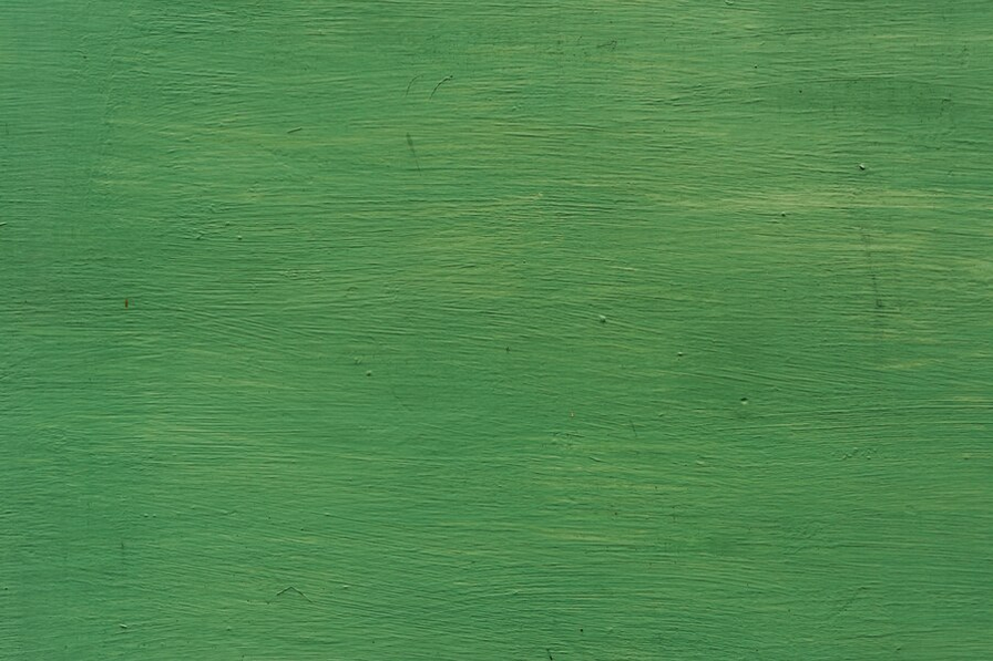
3. Neon Green
Neon green, akin to a burst of electric energy, is a color that’s bold and attention-grabbing. Homeowners often choose it to infuse their living spaces with vibrancy and a sense of excitement. However, neon green is not recommended by most professional house painters. Here’s why:
How Neon Green Negatively Affects One’s Mood
✔ Overwhelming Agitation: House painters frequently caution against the excessive use of neon green, as it can quickly lead to feelings of agitation and restlessness. Imagine being immersed in a perpetual burst of neon glow; it’s not an environment conducive to relaxation.
✔ Visual Distraction: The intensity of neon green can be visually distracting, making it challenging to focus or find tranquility in the space. This is a crucial consideration for those seeking a more calming ambiance.
How to Use Neon Green as an Accent
To harness the vibrant energy of neon green without overwhelming the senses, homeowners can explore these strategies, guided by experienced house painters:
✔ Strategic Accents: House painters often recommend using neon green as an accent color rather than painting entire walls in this bold hue. It can be employed in smaller doses through furnishings, decor items, or even trim work.
✔ Balancing Hues: Pairing neon green with calmer colors like muted blues or grays can help create a harmonious balance. House painters have the expertise to select complementary shades that work cohesively with neon green.
✔ Zoning: Another approach is to designate specific zones or areas within a room with prominent neon green. This adds a burst of energy without overwhelming the entire space.
4. Burgundy Red
Burgundy red, reminiscent of a fine Bordeaux wine, is a deep and rich hue that often evokes feelings of intensity and passion. It’s a popular choice among homeowners aiming to create a sense of drama and luxury in their living spaces. Two-toned rooms offer a visually captivating and stylish design approach by incorporating two complementary colors to create contrast and depth in your living spaces.
How Burgundy Red Negatively Affects One’s Mood
✔ Intensity Overload: House painters frequently advise caution when using burgundy red extensively, as its intense nature can lead to feeling overwhelmed. Imagine entering a room where every wall is drenched in this rich color – it can feel too much.
✔ Perceived Aggression: In some cases, burgundy red can create an aggressive or overly dominant environment. This can be a drawback for those seeking a more balanced and calming atmosphere.
Ways to Add Depth Using Burgundy Red
To harness the elegance of burgundy red without allowing it to overpower the space, homeowners can explore these strategies in collaboration with experienced house painters:
✔ Focal Point Wall: Instead of painting all walls in burgundy red, design one as a focal point. Professional house painters in Durham, CT, can help you choose the ideal wall, creating a captivating and dramatic element without enveloping the entire room in this bold color.
✔ Balanced Combinations: Pairing burgundy red with lighter or neutral colors can help balance its intensity.
✔ Accessories and Accents: Use burgundy red sparingly through furnishings, such as upholstery, curtains, or accent pieces. This allows you to introduce the color without overwhelming the overall space. Just make sure to contact your expert local house painters so they guide you in selecting complementary shades for trim, furnishings, or decor that harmonize with burgundy.
For those seeking professional house painters in Durham, CT, exploring nearby choices is wise. Custom Colonial Painting, a local company, is recognized for its impeccable house painting skills.
5. Electric Blue
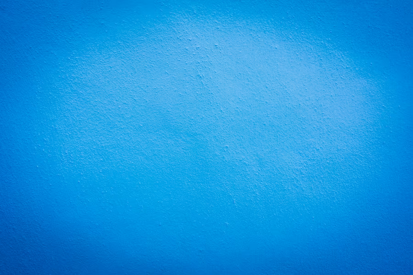
Like a vibrant bolt of lightning, electric blue is a striking and attention-grabbing color. Homeowners often select it to add a sense of drama and modernity to their living spaces.
How Electric Blue Negatively Affects One’s Mood
✔ Cool and Unsettling: House painters often caution that electric blue, when used excessively, can create a cool and unsettling space. Imagine walking into a room where everything is dominated by this intense shade of blue – it might evoke a sense of uneasiness.
✔ Need for Warmth: Electric blue often requires the counterbalance of warmer elements to create a harmonious atmosphere. This is a consideration for those who prefer a cozier and more inviting living environment.
How to Incorporate Warm Elements
To effectively utilize electric blue while ensuring it doesn’t make your space feel cold and unwelcoming, homeowners can explore these strategies in consultation with experienced house painters in Durham, CT:
✔ Warm Accents: House painters often recommend incorporating warm-hued accents and decor items, such as earthy tones or wooden furnishings, to counteract the coolness of electric blue.
✔ Textured Contrast: Introducing textures in the room can create visual interest and warmth. Consider using textured textiles like rugs or cushions in complementary colors to soften the overall effect.
✔ Strategic Placement: Designating electric blue for specific elements like an accent wall, furniture piece, or artwork can allow you to enjoy its striking appeal without overwhelming the entire space.
6. Hot Pink
Like a burst of tropical flowers, hot pink is a vibrant and bold color that often exudes a sense of fun, excitement, and youthful energy. It’s a popular choice among homeowners aiming to infuse their living spaces with vibrancy. From the perspective of professional house painters, its intense hue can sometimes overwhelm a space, making it feel visually chaotic and uncomfortable. The eye-catching nature of hot pink may create a sense of overstimulation, making it challenging to relax or concentrate in such an environment.
How Hot Pink Negatively Affects One’s Mood
✔ Agitation and Overwhelm: House painters often caution against using hot pink excessively, as its intense vibrancy can lead to feelings of agitation and overwhelm. Imagine an entire room painted in hot pink – it can be visually exhausting.
How to Use Hot Pink in Moderation
To enjoy the vivacity of hot pink while maintaining a harmonious and visually pleasing living environment, homeowners can explore these strategies in collaboration with experienced house painters:
✔ Accent Pieces: House painters often recommend using hot pink as an accent color rather than painting entire walls in this bold hue. Think of it as a pop of color through furnishings, decor items, or even an accent wall.
✔ Neutral Complements: Pairing hot pink with neutral colors like white, beige, or light gray can create a balanced contrast that allows the pink to shine without overwhelming the room.
✔ Color Schemes: House painters can assist in selecting complementary color schemes that work well with hot pink, ensuring a cohesive and harmonious overall look.
7. Dark Brown

Dark brown, reminiscent of rich coffee or the earth itself, is a warm and cozy color often chosen by homeowners to create a sense of comfort and grounding in their living spaces. A brown-painted room can exude warmth and comfort, creating a cozy atmosphere perfect for relaxation and unwinding.
How Dark Brown Negatively Affects One’s Mood
✔ Potential Dullness: House painters frequently advise caution when using dark brown as the dominant color, especially in spaces with limited natural light. The color has the potential to create a dull atmosphere that lacks vibrancy.
✔ Risk of Heaviness: Dark brown can make the space feel heavy and unwelcoming in poorly lit rooms. It’s a consideration for those who prefer a more balanced and inviting living environment.
Ways to Add Vibrancy and Contrast
To make effective use of dark brown while preventing the space from feeling monotonous or dreary, homeowners can explore these strategies in consultation with experienced house painters:
✔ Vibrant Accents: House painters often suggest incorporating vibrant accents, such as colorful furnishings or artwork, to add splashes of contrasting colors within the room.
✔ Texture and Patterns: Introducing textures and patterns can create visual interest in a predominantly brown space. To break up the monotony, consider textured textiles like rugs, patterned curtains, or decorative pillows.
✔ Strategic Lighting: Adequate lighting is essential when working with dark brown. House painters can recommend suitable lighting fixtures to ensure the room feels well-illuminated and inviting.
8. Pure Black
Pure black, akin to a moonless night or a sleek tuxedo, is a classic and elegant color often chosen by homeowners aiming to add sophistication and timelessness to their living spaces.
The Mood It Can Evoke
✔ Somber Atmosphere: House painters often caution against using pure black as the dominant color, as it can create a sad and confined environment. Imagine walking into a room where everything, from walls to furnishings, is black – it might feel too enclosed.
Ways to Add Vibrancy and Contrast
To enjoy the elegance of pure black while ensuring it doesn’t make your space feel overly confined, homeowners can explore these strategies in collaboration with experienced house painters:
✔ Accent Wall: House painters often recommend designating one wall as an accent wall and painting it in pure black while keeping the other walls in lighter shades. This creates a dramatic focal point without engulfing the entire space in darkness.
✔ Complementary Colors: Pairing pure black with contrasting or complementary colors for furnishings, trim, or decor can help break up the intensity. House painters can guide you in selecting these colors to maintain balance.
✔ Strategic Lighting: Adequate and well-placed lighting is crucial when working with pure black. House painters can recommend lighting solutions that ensure the room feels well-illuminated and avoid a sense of confinement.
9. Pale Pink
Pale pink, akin to the blush of a delicate rose or the soft hues of a sunset, is a gentle and serene color often chosen by homeowners to create an atmosphere of tranquility and charm in their living spaces.
How Pale Pink Negatively Affects One’s Mood
✔Overwhelming Softness and Passivity: According to professional house painters, while pale pink is often associated with tranquility, its excessive use in interior design can sometimes lead to an overwhelming sense of softness and passivity. This color lacks the vibrancy and energy found in bolder shades, which can result in an environment that feels too subdued or lacking in stimulation.
✔ Limited Stimulus for Creativity: If you use pale pink in spaces where creativity and productivity are essential, consider incorporating more stimulating colors or elements. You might introduce brighter accent colors or artwork that inspires energy and creativity. This balance can help maintain a tranquil ambiance while also fostering an environment conducive to work and innovation.
Ways to Add Vibrancy and Contrast
To make the most of the delicate charm of pale pink while ensuring it enhances the desired mood, homeowners can explore these strategies in consultation with experienced house painters:
✔ Tonal Harmony: House painters often recommend selecting complementary shades within the same tonal range to maintain a harmonious and serene atmosphere. This can include light blush furnishings, curtains, and decor.
✔ Accent Details: Incorporating pale pink as accent details, such as trim, moldings, or even ceiling paint, can add a touch of elegance to the room without overwhelming it.
✔ Natural Light Enhancement: House painters can assess the room’s natural lighting and suggest paint finishes that maximize the soft glow of pale pink, creating an even more serene ambiance.
When in need of professional house painters in Durham, CT, it’s a good idea to explore local options. Custom Colonial Painting stands out for its remarkable expertise in house painting, making it a potential choice to consider.
10. Olive Green
Olive green, reminiscent of lush forest canopies and ripe olives, is a versatile and earthy color often chosen by homeowners to create a balanced and harmonious atmosphere in their living spaces.
How Olive Green Negatively Affects One’s Mood
✔ Potential for Overwhelming Heaviness: According to professional house painters, while olive green is often associated with natural beauty and balance, its excessive use in interior design can sometimes create a feeling of heaviness in a room. This deep and earthy color can, in some cases, make a space feel too dark or closed-in, especially if it dominates the entire color scheme. often recommend olive green for those who seek to bring the serenity of the outdoors inside.
✔ Monotony: Olive green’s subtle and muted tones may, over time, contribute to a sense of monotony or boredom within a living space. Its earthy and calming nature can sometimes border on predictability, which may lead to a lack of visual interest or excitement in the environment, potentially affecting one’s mood negatively.
Ways to Add Vibrancy and Contrast
To fully utilize the earthy versatility of olive green and ensure it enhances the desired mood, homeowners can explore these strategies in consultation with experienced house painters:
✔ Complementary Neutrals: House painters often suggest pairing olive green with neutral colors like beige, taupe, or gray to create a balanced and soothing palette. This combination can lend a sense of warmth and sophistication to the room.
✔ Natural Accents: Incorporating natural elements such as wooden furniture, stone accents, or botanical decor can amplify the connection with nature that olive green offers. House painters can guide you in integrating these elements seamlessly.
✔ Accent Walls: For a more dynamic effect, consider using olive green on an accent wall while keeping the remaining walls in a neutral tone. This allows the color to make a statement without overwhelming the space.
Transform Your Space with Expert House Painters Near You!
Ready to turn your home into a haven of comfort and style with the perfect paint colors? Our team at Custom Colonial Painting in Durham, CT, is here to bring your vision to life. With years of experience, we understand the impact of color on mood and ambiance, just like the pros in the article. Let us help you choose the right shades and finishes, ensuring a polished and inviting space you’ll love. Contact us today for a consultation!